|
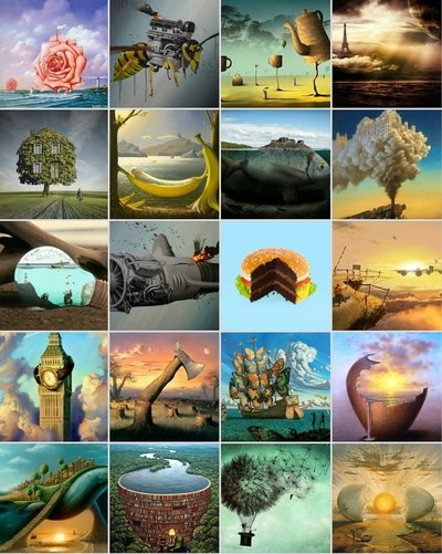
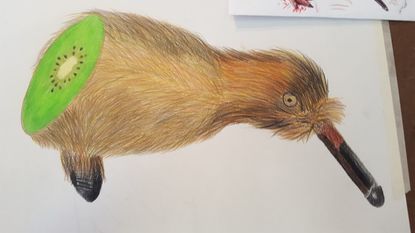
REQUIRED 1.) The art criticism process is a 4-step critiquing process for works of art. The first step is just telling exactly what you see of the piece. Secondly is analyzing the piece by looking at the title, the medium and techniques used to make it. Also looking at the certain style the artist used on the piece. Third is to interpret the piece by first figuring out what the artist is trying to say through their art. This could be done through metaphors, symbolism and many types of themes used throughout the piece. Next is what caused the artist to say this. For example, this piece here. 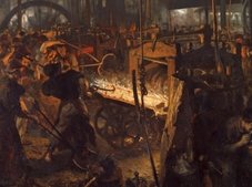 This is a piece of art portraying the realism of the industrial revolution. It shows child labor and the darkness and fire shows the horrors of this time. The artist wants people to know what real life felt and looked like at that time. The next thing is looking for historical milieu that surrounds the work. This means if there is any history or social culture affiliated with the piece. For my example you can definitely see the industrial revolution history. But for other pieces you may see metaphors or symbols representing politics, history or social classes. Now you want to analyze why the work was created in its particular style. For my example, it was created in a very realistic and detailed style to show every part of what life looked like in that moment. The artist wants to portray how busy the and crowded the environment in the piece. Lastly, you want to evaluate how successful or important is this work of art. If there is a lot of meaning and it is visually appealing that is probably and very successful piece. And the more meaning behind the art that is relevant the more important that piece could be. 2.) I'm going to critique my 2 in one piece. 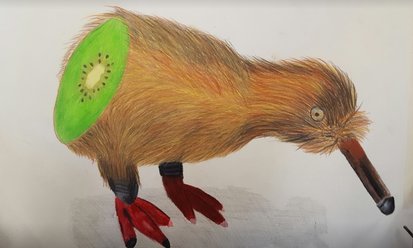 I see a kiwi bird cut at the back to show a kiwi fruit inside. He is on a white background but with a shadow below him. I came up with this idea from taking together a bunch of other ideas and picture for inspiration. My main inspiration was from a picture of a burger, but is was cut in half showing a chocolate cake inside, this was part of my 20 pictures in my blogpost. I then started brainstorming what I would do, I was thinking of words that were the same but had different meaning when I came to kiwi. I knew kiwi was a type of bird and a fruit, so I though I would cut the bird showing he's made of fruit. There are 2 different things in this piece, but can only be described in one word, "Kiwi". I chose to use prisma colored pencils so show the very vibrant colors of the fruit, and so I could draw each strand of hair on its fur. This piece is sort of making fun of the English language on how there are so many words that are the same but have different meaning, or that there are words that sound different to how they are spelled. I chose this just because I thought it was a little funny and very interesting. Mostly because the kiwi bird is very unknown of by most people and because I though it would be fun to make. There is no real historical milieu in this piece other than that kiwi birds and fruit are real things that exist. I created this in a realistic style to made it look almost as a kiwi was actually cut showing kiwi fruit inside to make it believable. I think this was a successful work of art because it finished looking realistic because of the fur and the color of the fruit. In the end, this piece finished looking very close to how I envisioned. PICK 3 QUESTIONS 1. What is art? Art is anyone expressing there feelings, beliefs or any thoughts through any form. Most used form of art is visual through paintings, drawings or sculptures. But another form is music, it is a very creative way of expressing your thoughts through beats and lyrics. Also there is literature forms of art. This lets anyone express feelings and so many types of ideas through words. Everyone can write something creative and tell a story. Combining these three forms of art creates movies, television and video games. Art is created and seen by everyone. Everywhere you look is created by art. There is architecture everywhere and every person you see has different ideas that can be expressed in any way they want. This example of art is just someone using their creative mind to fool someone using perspective. They show a very interesting use of perspective to show a fake whole going through their hand. 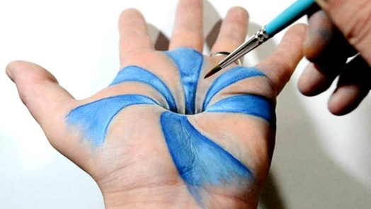 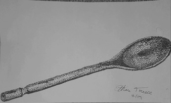 2. Regardless of whether a project was successful or not, describe one where you learned, grew, or developed the most from? Please explain. The pen part of our very first project was very interesting. Not just because of the pen, but I chose to use the stippling style for my piece. I was very intimidated by this but also very excited. I have never done anything like this style before, so I was worried I would mess up. I learned not to overthink the art. Instead of me just relooking every dot I put, I was fairly careless and just mindlessly let my head do the work by looking at the spoon and continuing. I am very happy with how my piece turned out in the end, and this really showed my how art isn't just about copying what you see, its all about using your head to explore different areas of your brain. Seeing things differently and transferring them to paper in your own way is more important than just copying. Not even halfway through this piece, I wasn't looking at the spoon anymore, just coming up with it in my head and building up the dark areas my own way. This made the piece so much more fun and stress free to create. 3. What is the point of this class? What did you get out of it? I think the main point of art 1 is introducing as many forms of art as possible to give students an opportunity to see what they are skilled at and what they enjoy. Giving an opportunity to many mediums and styles shows gives everyone a chance to find their strengths and weaknesses. From this class the main thing I figured out is that my favorite medium is prisma colored pencils. My biggest weakness is water color. 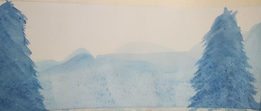 My water color landscape I am very unhappy with. I am very bad with handling and controlling water color when I use it. When I tried to layer the mountains, the paper was getting soggy and messing up, and when I tried to darken them the water just went all around the paper. I hope in the future to practice water color more so I can learn to control it more. I also want to try more stippling pieces. I really enjoyed making my spoon as I said in the last question. Things like that, stippling, if I never took this class I would never have known of it and now that I do, I want to try it more. I'm happy I took this class and hope to use the skills I learned in the future.
0 Comments
https://www.youtube.com/watch?v=fF_oKWEBwkY&feature=youtu.be
Click the link for the stop motion video!
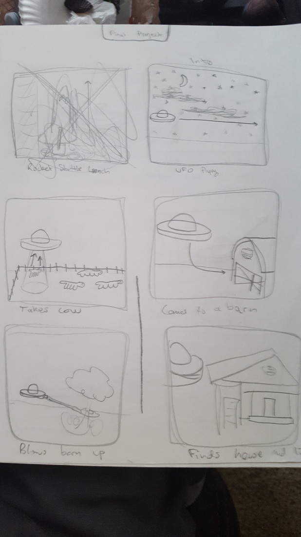
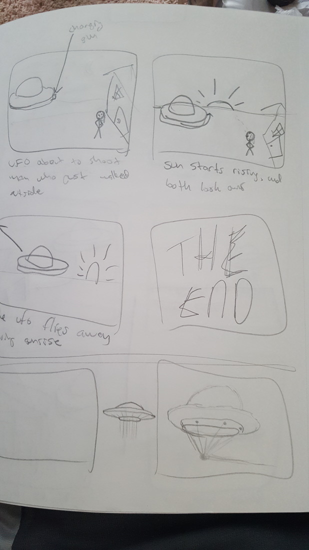
The story board is my original idea, but once I started the actual drawing and pictures I realized my limitations. But this story board is the start of what my final product is based on. I had to change up the scenes because I was running out of time and some of what I wanted would be too hard for this being my first stop motion.
https://www.youtube.com/watch?v=fF_oKWEBwkY&feature=youtu.be
1. My set is used for chips and dip. The tray is big enough to hold any crackers on chips on it and the flower can hold dip. 2. My idea was based on nature. The flower needs the sun just as your dip needs chips or crackers too. 3. I started with a slab of clay and molded it into a foam platter to make my own. Then I smoothed it out and put it in the kiln for firing. Next I started the flower. I got a bowl to place the clay petals in and then let them firm up. After I took it out of the bowl, I added leaves on the outside. Then I put the flower in the kiln. Once they were both fired, I glazed the tray yellow and the flower red and green. 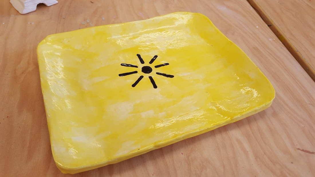 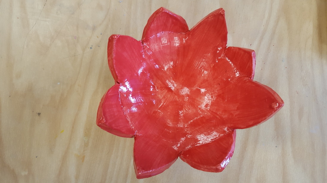 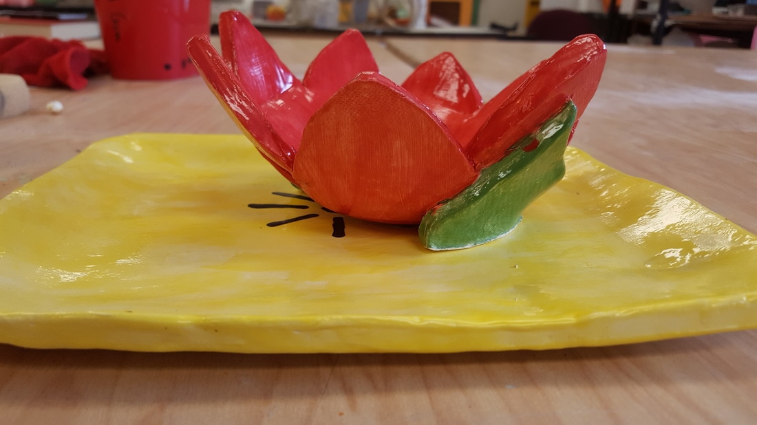 1. I used 2 point perspective since this is a building drawn from the edge. 2. I first sketched it out using pencil, and colored with prisma colors. I used them because I like how vibrant the color pencils are when coloring. This helped pop out the building from the picture. 3. This photo is taken from the senior parking lot at Apex High School. I took a picture of the corner of C building since this is the last year it will be standing. 4. The basic shape of the building was easy with the perspective, but once I got to the more intricate details like the windows it got difficult to keep the perspective. Also adding bricks to know its a brick building got difficult without cluttering the entire piece with lines. So I just put a few lines inches apart to show its a brick building but keeping the visuals good. Also the trees were hard to fit into the perspective while making them believable. 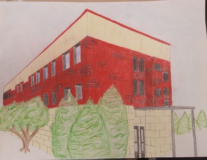 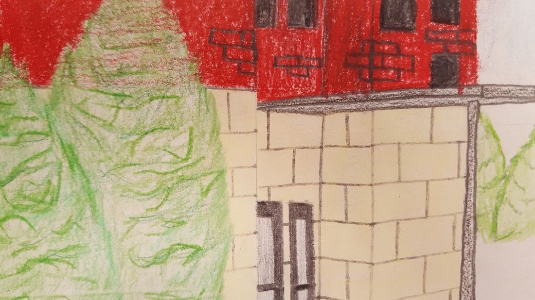
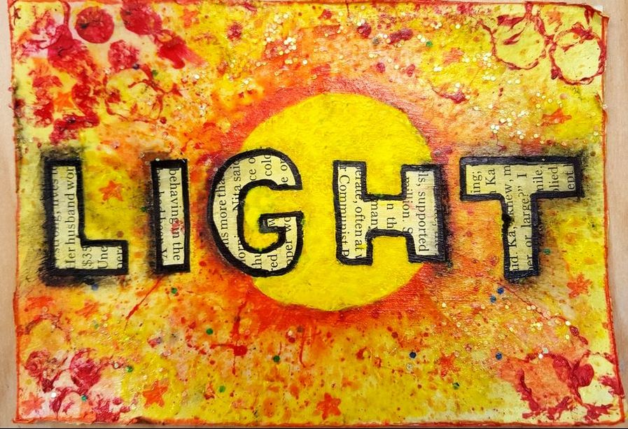
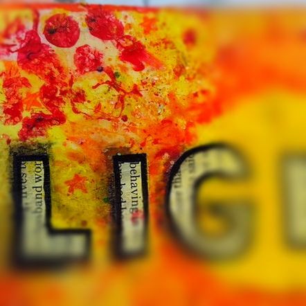
1.) The first layer was the tissue paper that I glued on as a background with lots of yellow and some red and orange spots around. Secondly I made a template for a circle and created the yellow sun in the middle of the piece. While I waited for that to dry I used red paint to add circles around the edge of the postcard. After the yellow circle was dry, I covered it and spatter red/orange paint around the edges of it to show a sun blowing up of light. I did multiple layers of that until it looked right, and then added the text. I cut out letter shapes from a magazine and then glued that to the post card using modge podge. After that was dry I colored the letters yellow and outlined them in sharpie marker. After that I made random splatters of red paint around the edge and cleaned up the edges of the sun to have a sharper look. My final touch was some sparkles around the letters but not in the sun or on the letters.
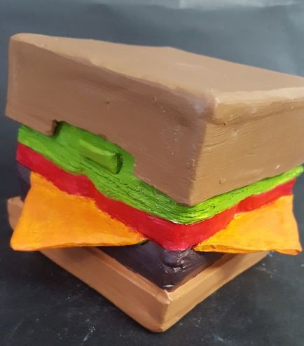
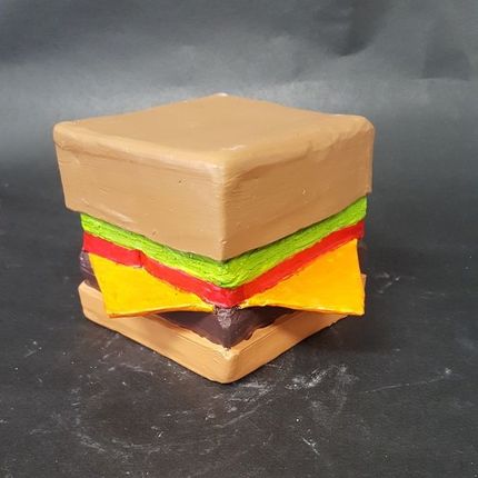
2.) My word was "light". I portrayed it by using very light like colors like yellow, orange and red to represent sunlight. I made a sun in the middle exploding with light and colors. Then I just added the word "light" using cut out magazine pages. This I colored yellow, again the show off the colors of the sun. Then I just added random red design around the edge for some extra color. 1.) After the sculpture part was finished and was all dried out, I started to paint the burger. I painted with acrylic paint using vibrant colors to make the cheese, lettuce, and tomato really stand out against the brown of the bigger buns. After the paint was done, I chose not to glaze the finished part. This is because I didn't want the burger to shine, but let the colors stay vibrant on their own without any shine to it. 2.) I think the finished piece was successful in the fact that the shape and colors came out the way I hoped. I didn't want a regular circular burger, so I kept most of the box feel to it to make it seem unique. Also I'm really glad the cheese didn't break off. Having such thin clay sticking out so far out of the box is a risk I took, and I'm happy it is strong enough to act as a handle for carrying the box. 3.) If I were to do this again I would add more toppings to the burger, like onions and pickles. That would make it seem more like a real burger and let me add deeper detail to help it look better. I also wish I could have found a better color for the buns. It took a lot of time mixing the paints to get the color I used as my final product, but I wasn't very happy with it. If I had more time I would have spent more of it trying to get the right color. Lastly I would have spent more time on the detail. If I spent longer with keeping my color paints within where those colors should go than my final product would have come out looking more professional and clean.
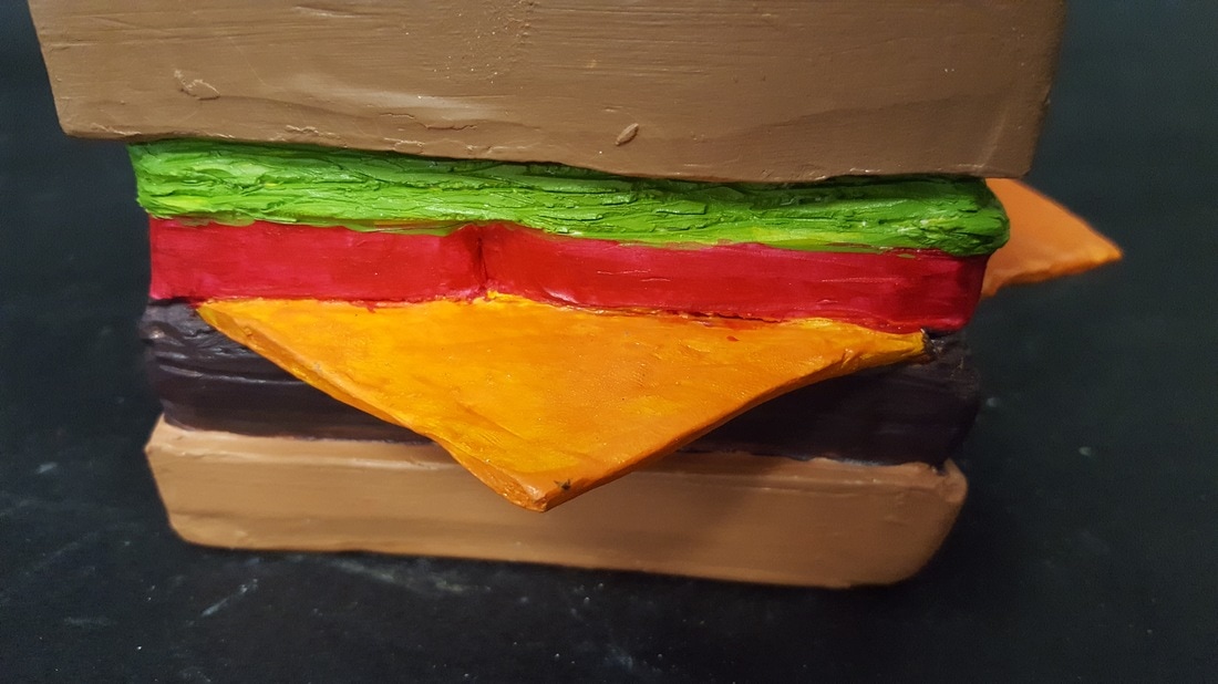  1. I plan to have a burger piece with the top bun as a lid and the cheese as handles. I want to add very vibrant and smooth colors to the burger. I really want the cheese and vegetables inside to catch the attention with vibrant reds, greens, and orange.
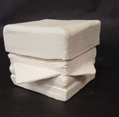
2. So far the most difficult part has been carving the curves inside the piece to add curve and definition to each part of the burger. I want each layer to be defined as its own by having unique depth and color. 3. So far I think my lid and general box shape is very successful. The lid fits on very smoothly without wobbling at all, and I built the box sturdy enough to not crack. 4. First I had to slab the clay to put together the box. I had different shapes cut out to make it and even square box and put it all together by scoring and slipping the edges. After the box was done I cut off the top for the bun/lid shape and then carved out the definitions. I then added the cheese by scoring and slipping, and lastly made a way for the lid to stay on.
|
AuthorWrite something about yourself. No need to be fancy, just an overview. Archives
June 2017
Categories |

 RSS Feed
